" height="16px" id="zdH2ngsvY" width="15.999999821623987px"/></svg>)
Personal Design System
Building a scalable system for consistency and speedsite
Team size:
1
Category:
Personal Design System
My Role:
UI/UX Design
Context & Background
During my early UI explorations, I applied colors and styles manually without a structured token system.
Over time, I noticed inconsistencies between similar components and started questioning how larger products maintain visual consistency at scale.
That’s when I realized I didn’t just need better UI — I needed a system.
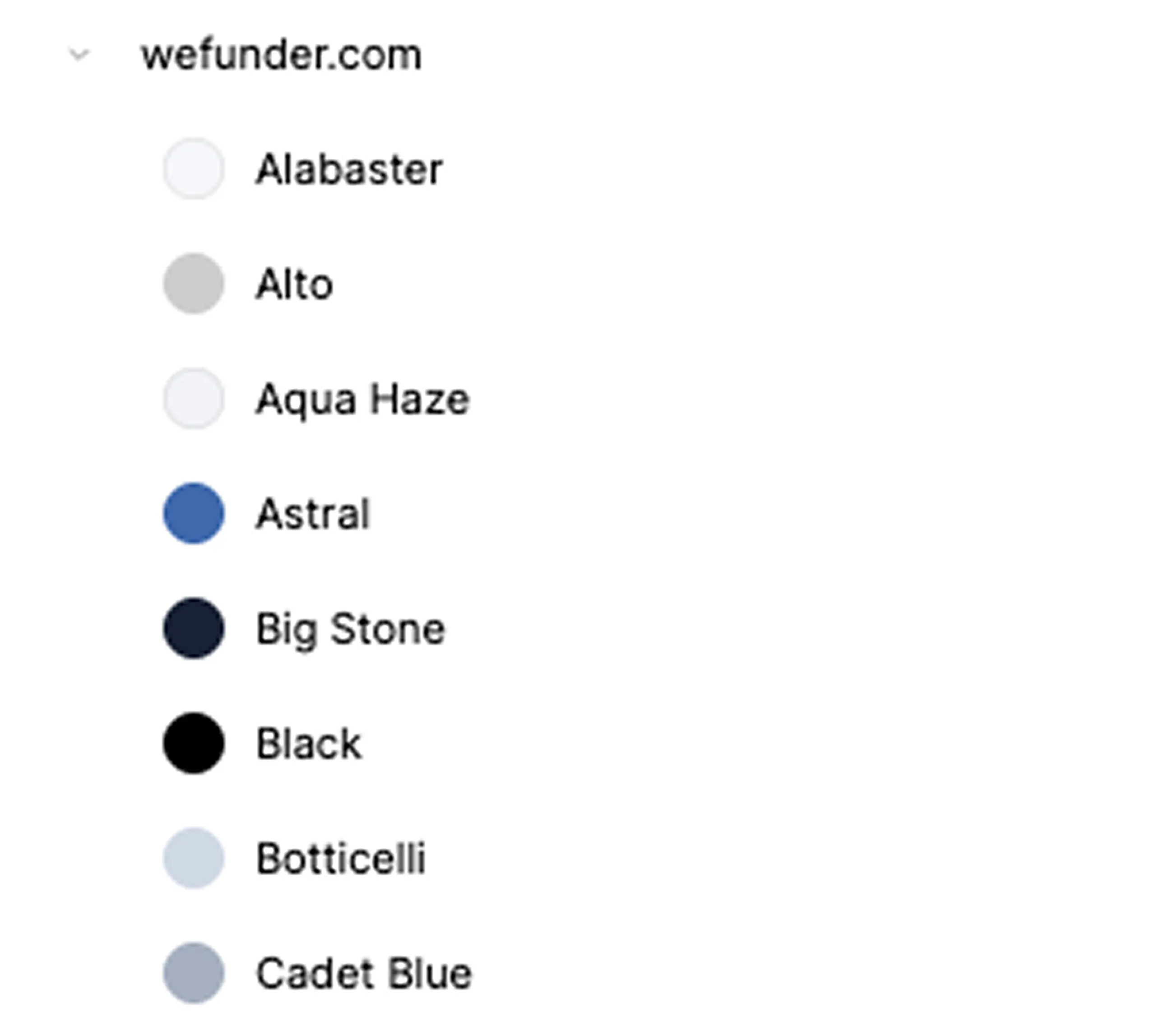
*Before introducing tokens and component structure

Token Foundation
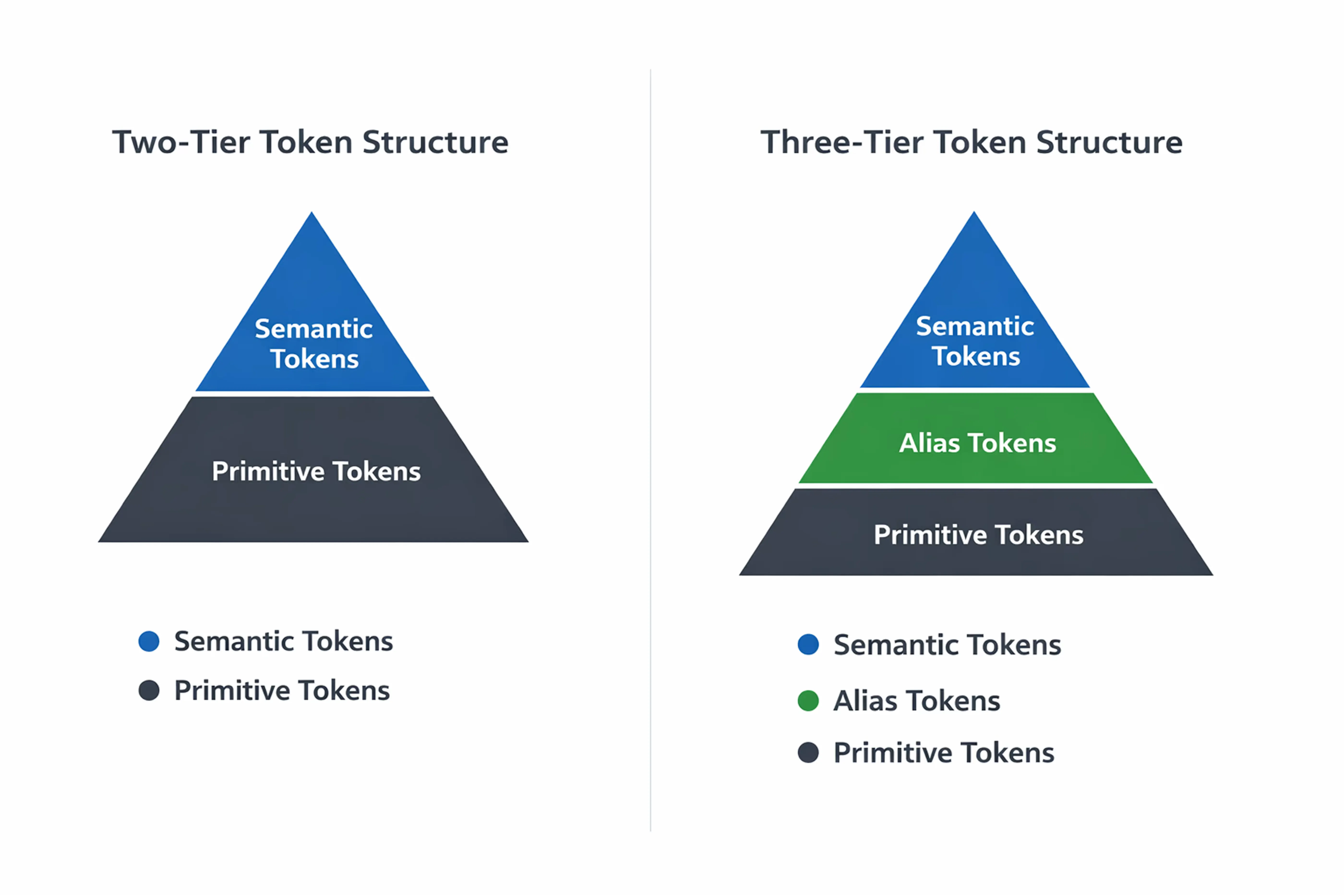
From the beginning, I structured the color system using a three-tier architecture to ensure scalability.
Brand (Primitive) defines raw color values.
Alias (Semantic) assigns functional meaning based on usage.
Mapped (Component) applies those semantic roles directly to UI components.
This approach separates value, meaning, and implementation, making the system easier to maintain and extend.
Instead of using a simple two-tier structure, I chose a three-tier architecture from the start to clearly separate value, meaning, and implementation.
This prevents components from referencing raw colors directly and allows semantic roles to remain stable even when brand values change.
Component Architecture
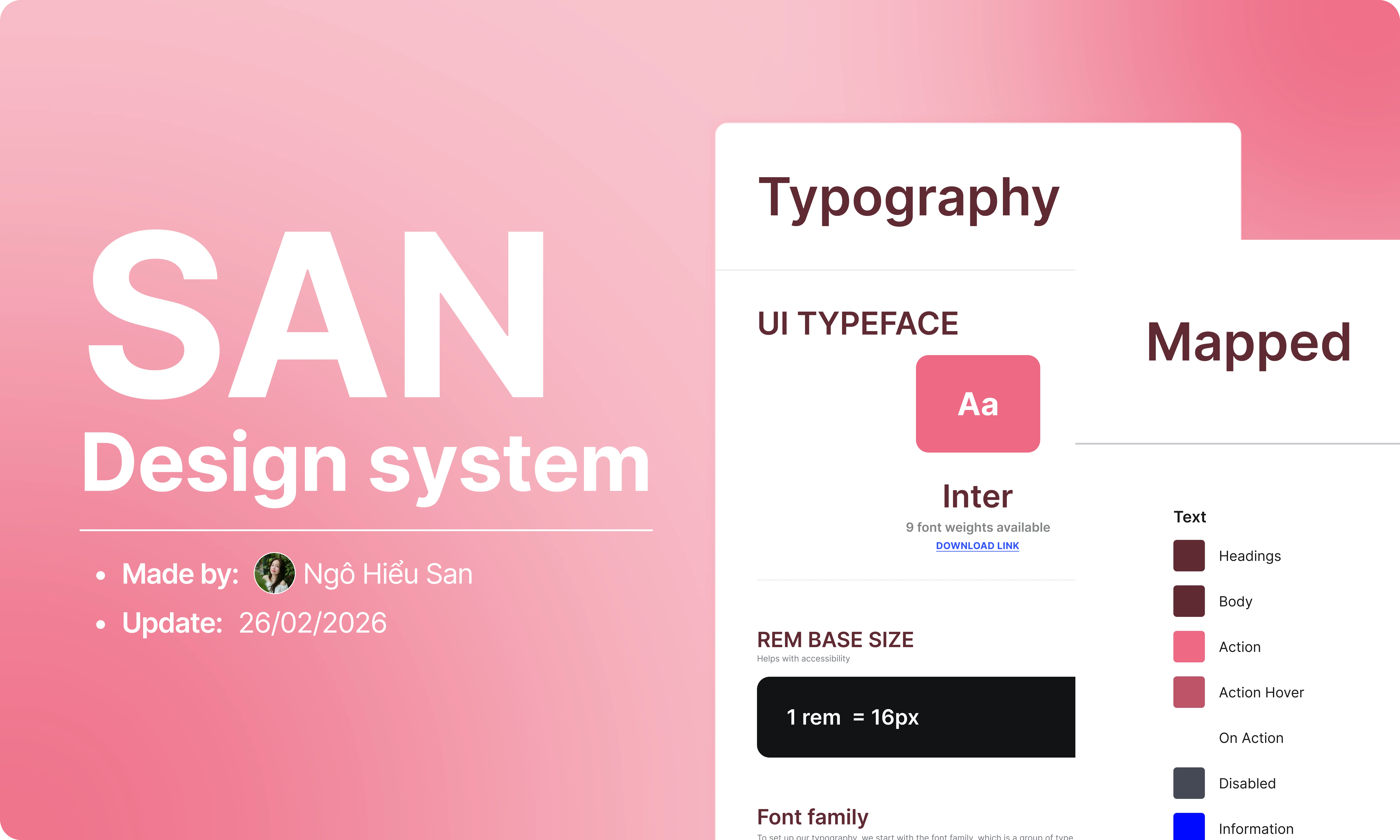
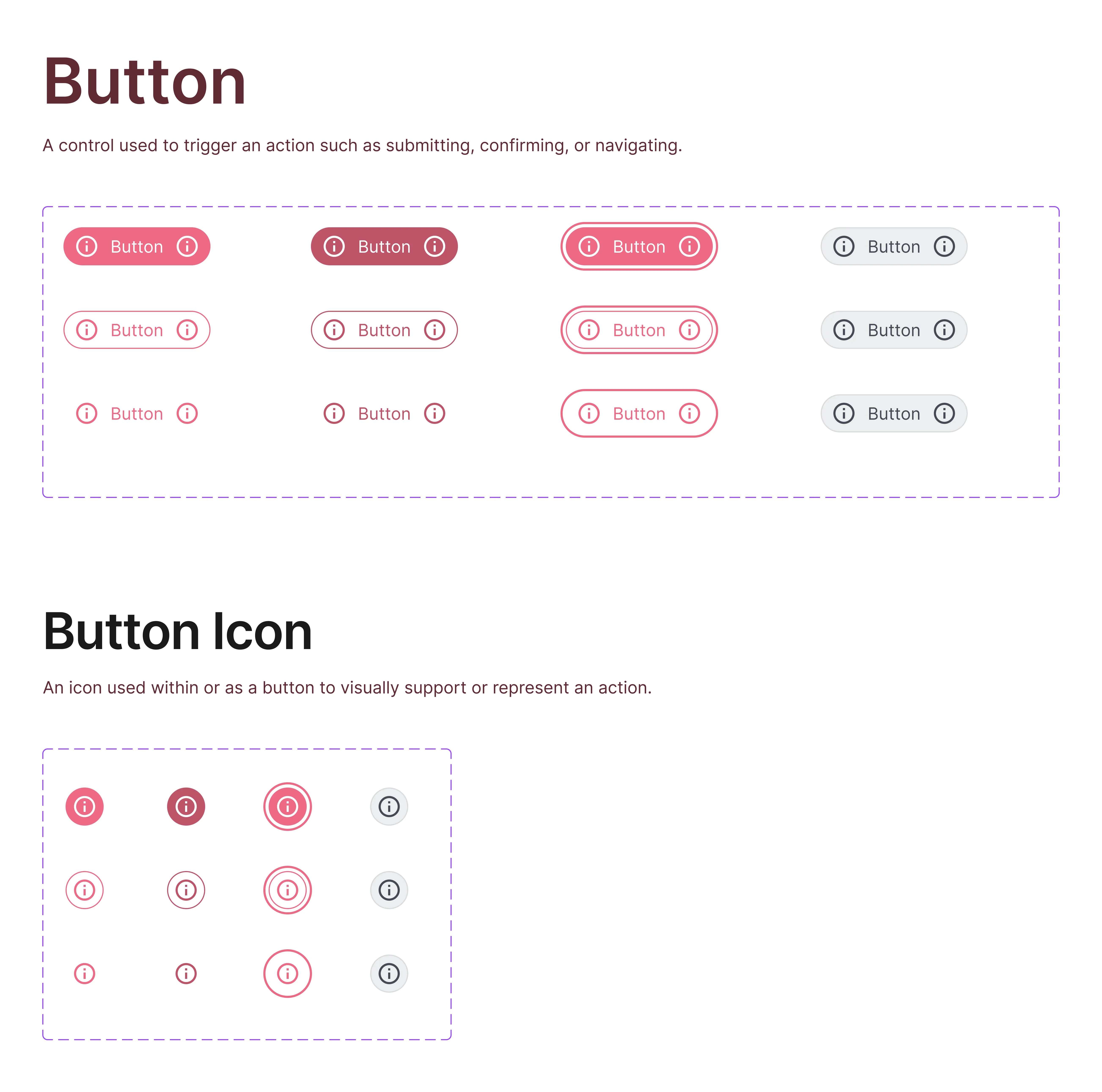
Components are built with Auto Layout, variants, and boolean properties to support flexible configurations without duplication.
Nested components enable shared elements to be reused across multiple parents, improving consistency and maintainability.
All components reference semantic tokens, allowing automatic updates across themes and states.


Practical Application
The system is applied to real layouts using predefined components and token mappings.
Instead of styling each screen individually, layouts are assembled from structured components connected to semantic tokens.
When tokens change, components and screens update automatically, ensuring consistency across the interface.
This demonstrates how the system supports efficient iteration and scalable UI development.
Reflection
Designing systems, not just interfaces
Learned how tokens, components, and usage connect as one system
Improved ability to think in scalable structures
Shifted mindset from visual design → system thinking
File Access
The full design system is publicly available for viewing and download.
Designers can inspect the token structure, component logic, and layout behavior, or use it as a starting point for their own projects.
View and download the file here: [Figma link]
Related Projects